
We’d like to think that todays $1000+ LED LCD displays are great but I’m going to say they’re not. They suck actually. We just don’t know better because we haven’t seen anything better – yet. Today’s displays are like cars from the 1970s – much better transportation than a decade prior but still horribly polluting, underpowered and unsafe in comparison to what’s coming in the next few decades. Today’s desktop computer monitors are fairly low resolution ranging from 72-150ppi. While this works fine for 95% of the people out there communicating via email and browsing the web, its having some negative consequences when it comes to photographic image development. People are over sharpening their images and including too much localized contrast. Most importantly, we’re taking out noise that can be beautiful and make prints look incredible.
The original digital capture [left and above right] is so typicially clean that it can lead to bland, boring prints. With grain added in LR/ACR the image prints beutifully with a luscious, precision fine texture. We’ve come to the incorrect assumption that becuase noise and grain looks terrible onscreen it will be equally terrible in print. That’s a false assumption.
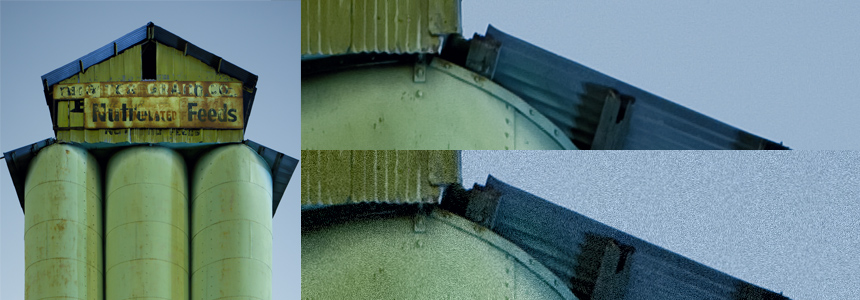
The image above is not a retina compatible image – that’s on purpose. When viewed on a retina display the grain you see adove looks good. And that’s part of the point I’m making. Low res devices display noise and grain horriblly while the same images can be surprisingly beautiful on high resolution devices (retina displays and printers).
There is so much focus these days on noise reduction that we see lots of prints that have this unnatural, freakishly smooth, airbrushed looking, and un-photographic quality to them. Noise, as it turns out, is like cholesterol: there are good and bad kinds. We need to train ourselves to recognize the good from the bad and embrace, even encourage, the good. Generally speaking, the colorfulness of noise is bad and luminance noise is what can be good. Luminance noise, like black and white film grain, can be incredibly gorgeous, and conducive to the image, especially on larger prints. You may have noticed that Lightroom and ACR now have a Grain tool, that actually adds noise to images the don’t have it. I’m seeing people overlook this tool altogether and, in my opinion, instead focus too much on reducing luminance noise.
We’ve trained ourselves to think that noise is bad. After all, on today’s crappy low resolution monitors, noise does look bad. But that noise can look beautiful when printed! And it will look beautiful on the 220+ppi displays like the retinaMacBookPro and the desktop displays that we’ll start seeing next year. We’ll look back and wonder how we got along with today’s horribly low res piece-of-junk displays.
Recommendations
High ISO cameara noise is the ugliest of the bunch, so it naturally makes sense to shoot at the lowest ISO you can for this and other tonality reasons. When developing, remove the color noise but try leaving the luminance noise in your images. And consider adding some with the grain tool – I dare you! Keep in mind that the grain tool resolution is specific to the image capture resolution so it might work well at some sizes but not at others. I think the optimal place to add grain is at the final print resolution. Lightroom’s grain tool should, IMO, be in the Print module. For the time being, some users might wish to add grain in Photoshop at the final print size and resolution (which is really too abd because LR/ACR’s grain algorithm is amazing and hard to replicate in PS). I hope the grain tools will improve in the next few years!
Find *the right* kind of noise/grain for your liking. For me, a very tight, sharp edged, fine grain is reminescent of Diafine film development and compliments image content nicely. Mark my words – grain will be the next ‘big thing’!
What can we learn from this?
We can make prints. People today need to seriously question what they see onscreen and make prints. I recommend buying inexpensive rolls of RC media and burn through it on a regular basis. Throw-away test prints also help keep an inkjet printer healthy and clog free. Let your conclusions and image development be driven by these prints. Once you develop images that make great prints you’ll find they’ll look even better on screen. And you might just fall in love with grain again.
Another vote for having grain control in Lightroom in the output/print stage. It needs to relate to final output size and sharpening.
Thanks! Yes!
I totally agree with you Scott, as a printmaker I use to recommend to my customers the use of a fair ammount of “noise”, even when I do the post-production of some of their images I use to add grain in LR, from where I do print too.
Also I have to agree with you on having the grain control in the print module, as the output sharpening options, but with an option to visually preview those effects.
Great article, thanks!
Nice to meet another grain advocate!
Yeah Scott!
Thank you for your comment.
As a documentary photographer currently working on a book about a small village in northern Chihuahua in the vicinity of the Sierra Madre, I find that it is much more accurate and feels right to have the “noise” in my images. The village is filled with buildings in ruins, the environment overall is gritty, dusty and deteriorated, however the landscape surrounding it is unspeakably beautiful and pristine. I like showing the images of the village with the “noise” created often by low light-nightime situations that I am recording.I often shoot at night and push my ISO as much as needed. I feel I capture the mood, spirit and emotion of this place with more accuracy.
I would not feel comfortable depicting this village in a perfectly airbrushed, smooth and perfect digital image, it would certainly in my opinion, detract from its character an drama. I also appreciate the contrast between the gritty images and the pristine landscape setting in the foothills of the Sierra Madre, which results.
Carlotta Boettcher